|
|
|
Is a Puffersphere an effective medium for visualising
real-time global earthquake events? |
|
Callum Scougal |
|
Abstract Little research has been conducted on the effectiveness of
real time mapping on three dimensional surfaces such as Pufferspheres. This research aims to assess the
effectiveness of using a 3D sphere for visualising real-time geographical
information by mapping live earthquakes across the globe for a weekly
period. In order to conduct this
research, a Python script was developed to automatically retrieve and plot
United States Geological Survey data against a satellite base map. The resulting output was then processed
using a selection of tools to create a Puffersphere
compatible visualisation. The
visualisation was subjected to a user trial at the Royal Scottish
Geographical Society in Perth, in order to determine its effectiveness in
displaying geographical data and developing understanding and interest in
geographical topics like earthquakes among the public. The results strongly imply that the
visualisation was very effective in visualising earthquakes and in helping
members of the public learn about the dynamics and distribution of global
earthquakes in a real-time context.
Primary Research
Question Is a Puffersphere an effective
medium for visualising real-time global earthquake events? Research Objectives: 1)
Automatically retrieve United States Geological Survey earthquake data
as a CSV file. 2)
Develop a system which can accurately and precisely map real-time
occurrences of earthquake events upon a Puffersphere. 3)
Ensure that the earthquake data effectively conveys the distribution,
magnitude and frequency of real-time earthquake events. 4)
Gain user feedback on the effectiveness of the visualisation Methodology
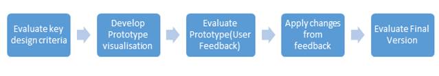
To display a visualisation upon the Puffersphere, a 2000x1000(pixel) image or video must be provided to the PufferWarp box within a Puffersphere unit. This box takes an equi-rectangular image and warps it to a projection suitable for a spherical device. This section briefly describes each of the core steps in creating a real-time map of global earthquake event’s over a weekly period. Python and an array of modules, such as Basemap and Numpy were used in combination with ImageMagick and FFMPEG to develop this visualisation. The process of creating the visualisation can essentially be split into three separate sections: 1)
Evaluation of key design criteria 2)
The retrieval and plotting of earthquake data upon a satellite base
image using Python 3)
The rolling of images to ensure global rotation upon a sphere and the
compression of these images into an mp4 video format via Python, FFMPEG and ImageMagick. Results Once the visualisation was constructed, it was subjected to a user trial at the Royal Scottish Geographical Society in Perth. The results gained suggested that the visualisation was much more effective than a traditional 2D image and that it was easy to understand the magnitude and distribution of earthquakes across the world. Overall 80% of the users tested found the visualisation helped change their understanding of earthquakes, and 100% of users felt the Puffersphere visualisation was an effective way of visualising global earthquakes. Feedback gathered from users suggested that a range of changes could be made to improve the visualisation, such as more intense colours, a tectonic plate map and an inbuilt legend. These changes were implemented for the final version, as seen below. Conclusion Overall the results from this
research strongly indicate that the primary and secondary research objectives
have been achieved and that the Puffersphere is an
effective medium for visualising real-time global earthquake events. The next major
step in development would be to incorporate more sensory capabilities, such
as touch screen capabilities and an audio based commentary. These combined with the current
visualisation would allow the creation of a much more complete and exhibition
ready visualisation which could help truly highlight the Puffersphere’s
effectiveness for visualising geographical information. References Ainsworth, S and Loizou, A. (2003) The effects of self-explaining when
learning with text or diagrams. Cognitive Science, Vol. 27, pp.
660-681. Bertin, J. (1978) Theory of communication and theory
of ‘the graphic’. The
international yearbook of Cartography Vol.
18, pp 118-126 Riedl, A. (2007)
Digital Globes. In Multimedia
Cartography, pp. 256-266 Riedl, A. (2009) State
of the art tactile hyper globes. In: Buchroithner,M, True 3D in Cartography: Autostereoscopic
and solid visualisation of geodata. Lecture Notes in Geoinformation
and Cartography, pp. 215-226. Schratt, A and Riedl, A. (2005) The potential of three-dimensional
display technologies for the visualisation of geo-virtual environments. ICA
Cartographic Conference, 2005, A Coruna, Spain. Tufte, E. (1983). The visual display of quantitative
information. Graphics Press,
Cheshire, Connecticut |