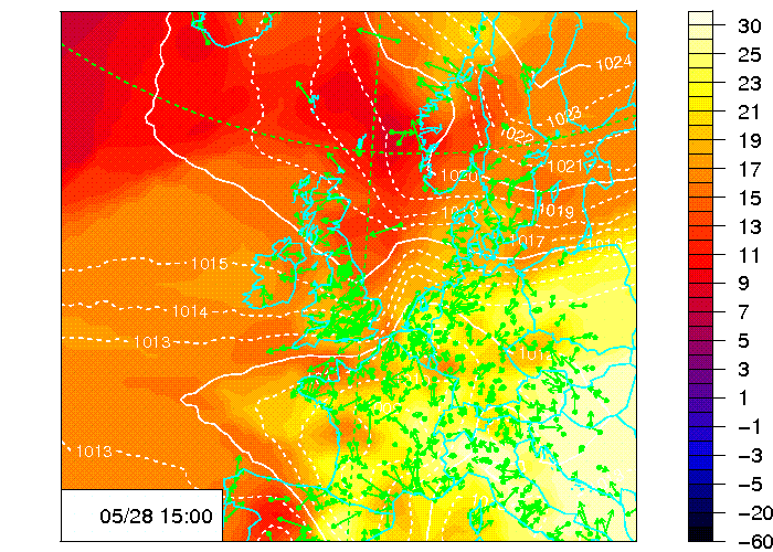
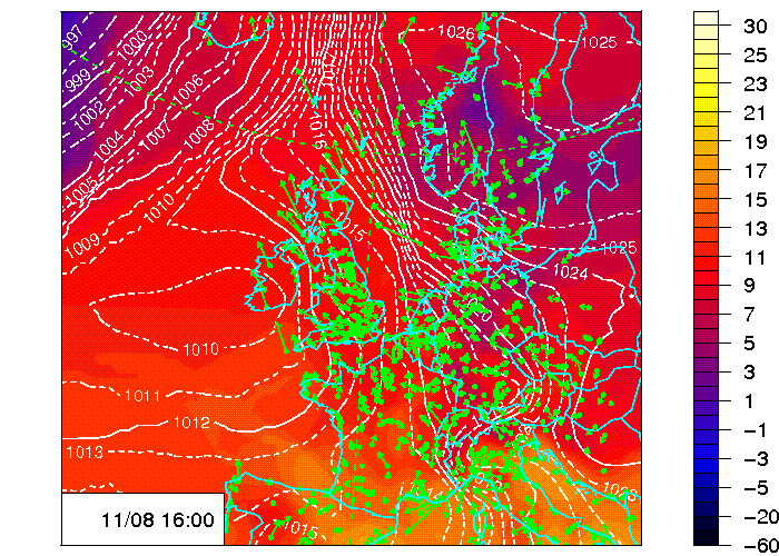
These two maps show up-to-date pressures and temperatures over northern Europe. They are made by a simple interpolation scheme from the weather reports issued every hour by airports. You can get these from NOAA. The pressures are in hectopascals (a.k.a. millibars) with a solid isobar at the traditional every 4 hectopascals and a dashed isobar every hectopascal. The colours are temperatures in degrees Celsius. The green dots mark the airports -- the distribution means that the contours are more reliable over the eastern part of the map. Note that the time in the box is always GMT, so in the summer it will be an hour behind your watch.
It is still pretty experimental at the moment. Suggestions for improvements to H dot C dot Pumphrey at ed dot ac dot uk.